Monday, 13, Apr, 2026
- हाईकोर्ट ने फरलो देने से इनकार मौलिक अधिकारों का उल्लंघन
- Call for Chapters: Books and Journal by Bharati Vidyapeeth’s New Law College, Sangli: Submit by May 5
- Internship Opportunity at Deed and Defense Law Firm, Ghaziabad [2 Months; Unpaid]: Apply Now!
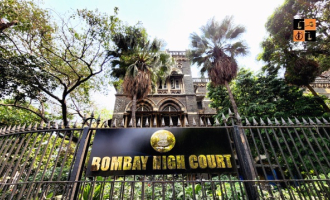
- राजस्थान में पशु चिकित्सा अधिकारी परीक्षा तय तारीख पर, हाईकोर्ट ने टालने से किया इनकार
- 9 मार्च को मेरा दिल बैठ गया...' भरी अदालत में क्या बोले अरविंद केजरीवाल, जस्टिस स्वर्णकांता ने सुना दी खरी-खरी
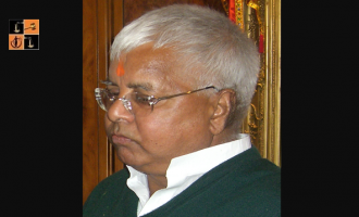
- लैंड-फॉर-जॉब्स: सुप्रीम कोर्ट से लालू यादव को झटका, केस और चार्जशीट रद्द करने से इनकार; पेशी से मिली छूट
- Land-for-Job Scam: SC refuses to quash CBI FIR against Lalu Prasad Yadav and his family members
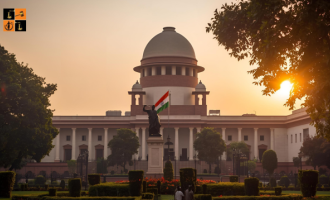
- SC issues notice to Centre on PIL challenging provisions of Digital Personal Data Protection law
- [Live Updates] Delhi HC hears Arvind Kejriwal for recusal of Justice Swarana Kanta Sharma in Excise case
- सुप्रीम कोर्ट में टली बांके बिहारी मंदिर मैनेजमेंट मामले की सुनवाई, दो हफ्ते बाद का समय
- SC notice to Centre, EC on plea seeking to implement finger, iris biometric system at polling stations
- Webinar on Preparing for AGI – The Age of Superintelligence by AI Safety Hong Kong (AISHK) [April 28]: Register Now!
- रेलूराम पूनिया हत्याकांड केस में नया ट्विस्ट, 'कातिल बेटी' ने खुद को बताया पीड़ित, सुप्रीम कोर्ट में दी नई दलील
- National Disaster Management Authority Internship Programme 2026 [UG/PG; 6-8 Weeks; Stipend of Rs. 12k]: Details Here!
- Call for Research Assistants with Mr. Gyan Prakash Kesharwani, Advocate & Chairperson at VidhiAagaz [Stipend upto Rs. 10k]: Apply April 20